|
What colours get travel photos the most Instagram likes? The Pantone Color Institute, working with influencer marketing platform Fohr and Visit Carlsbad (the convention and visitors bureau for the California town), has released the results of the 2019 "Colors of Travel Study," which identifies trending colours used in inspirational travel photos across social media and the colour psychology that informs these themes. To create the study, Fohr selected 75 influencers with an Instagram following of 50,000 or more and their five most engaged Instagram photos. These images were analyzsed to determine the four most common colours.
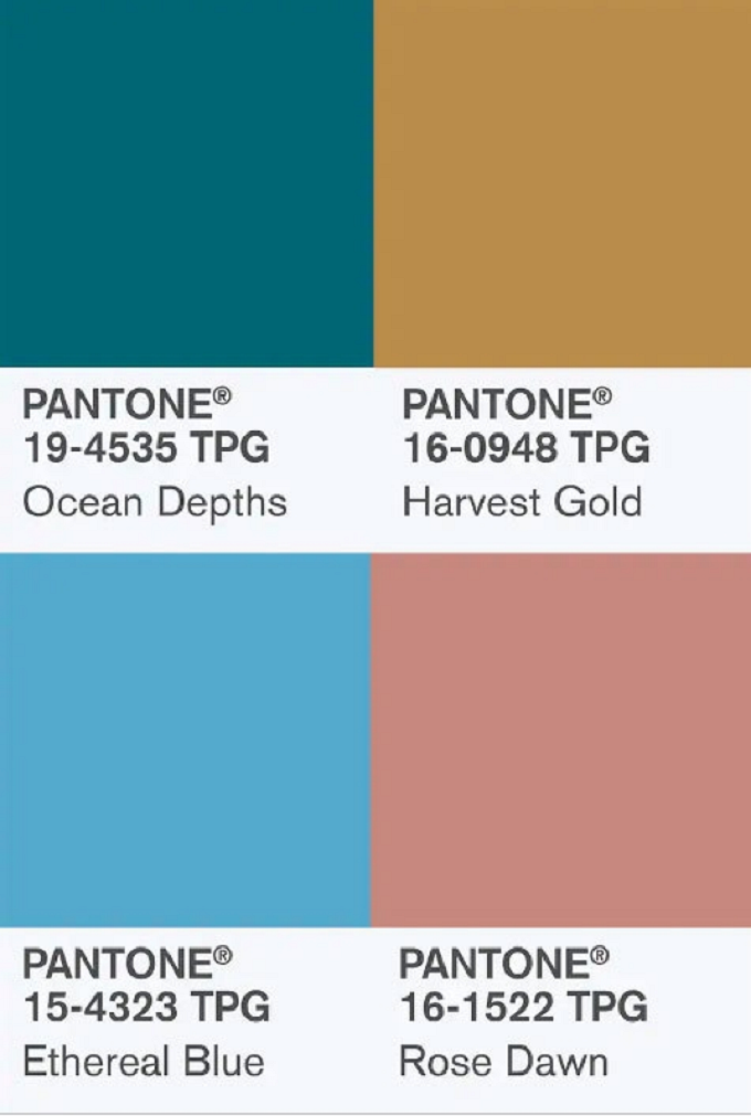
According to the study, this year’s trending colours of travel are Pantone 16-1522 Rose Dawn, "a gentle and comforting or soft and subtle or warm and welcoming dusty pink"; Pantone 15-4323 Ethereal Blue, "an open and expansive blue hue"; Pantone 19-4535 Ocean Depths, "a refreshing deep teal reminiscent of the colour of the sea, coastal shorelines and the watery paradise of deep lagoons"; and Pantone 16-0948 Harvest Gold, "a warmly lit solarized shade emblematic of autumn’s yellow florals as well as spectacular sunsets and exotic culinary surprises."
 “Colour has always been a part of why we travel. The desire to 'see' a new place is rooted in a mental image we've already conjured: we are drawn to land and cityscapes that look drastically different to our own. Instagram's influence over people's travel decisions is incredibly dominant,” says Grace Murray, VP at Fohr. “Using a quantitative analysis approach, we discovered that the current trending, appealing and engaging hues in inspiration travel photos are much more grounded, calming and muted compared to the vibrant hues from a similar study last year.”
 “This year’s colours highlighted in the 2019 'Colors of Travel Study' brings to life the unique beauty of Carlsbad’s natural surroundings and wellness-oriented lifestyle,” Laurie Pressman, VP of the Pantone Color Institute, said in a statement. “Calming and comforting, yet at the same time inspiring our imagination and containing a touch of the exotic, a palette of colour that expresses our desire to engage, connect and experience; not only with nature and with others, but also with ourselves.”
|